Brief
Petit Vour is a cruelty-free lifestyle brand that offers a monthly. beauty box subscription. I served as their Lead Designer and then Director of Brand and Content for three and a half years.
Most recently, I worked with the Creative Marketing team to produce Petit Vour’s rebrand campaign with a fresh, modern feel. I strategized and art directed the copy, typography, content, and redesign of the site, as well as all of the custom front-end coding across all devices for an omni-channel experience.
Together with the launch, I created an editorial calendar, strategizing and designing the email marketing, social posts, and media outreach for a 360 campaign experience.
The Homepage
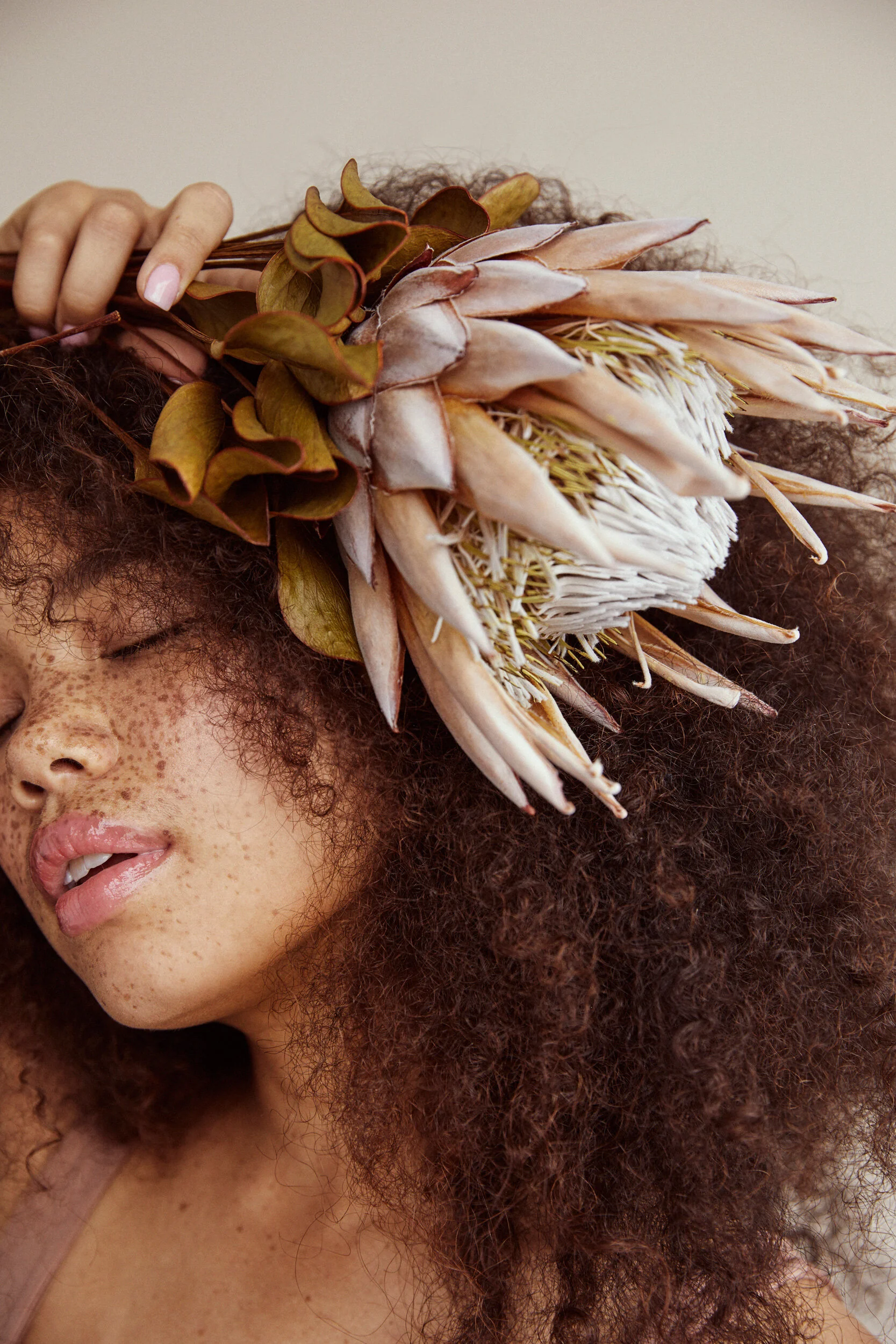
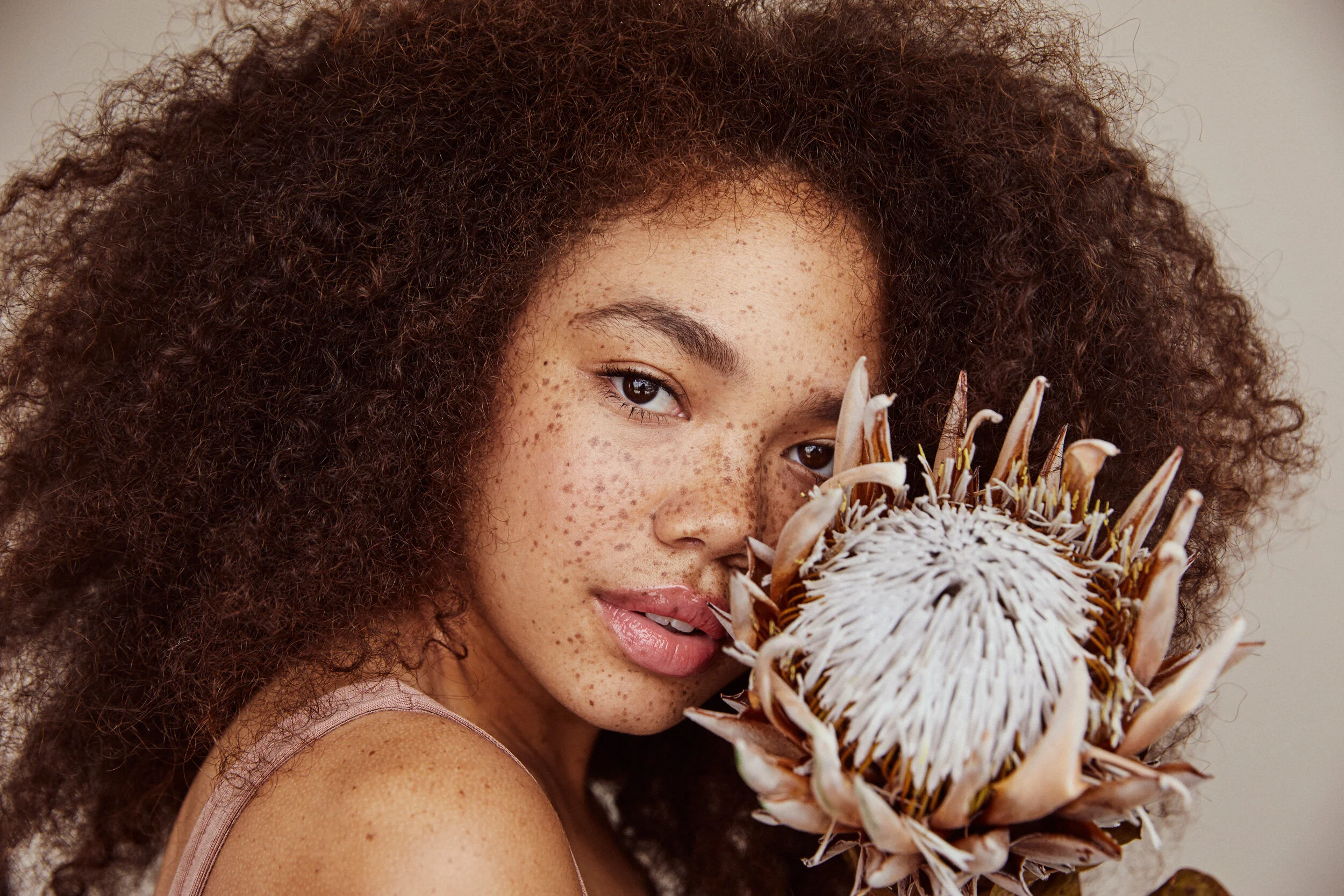
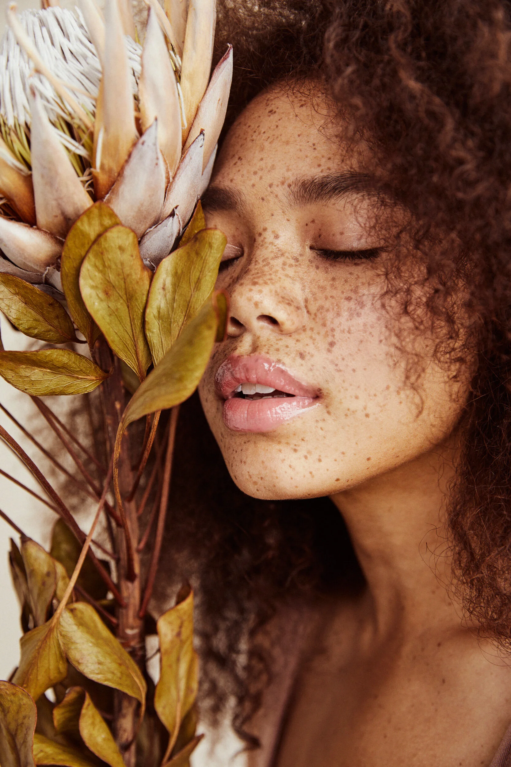
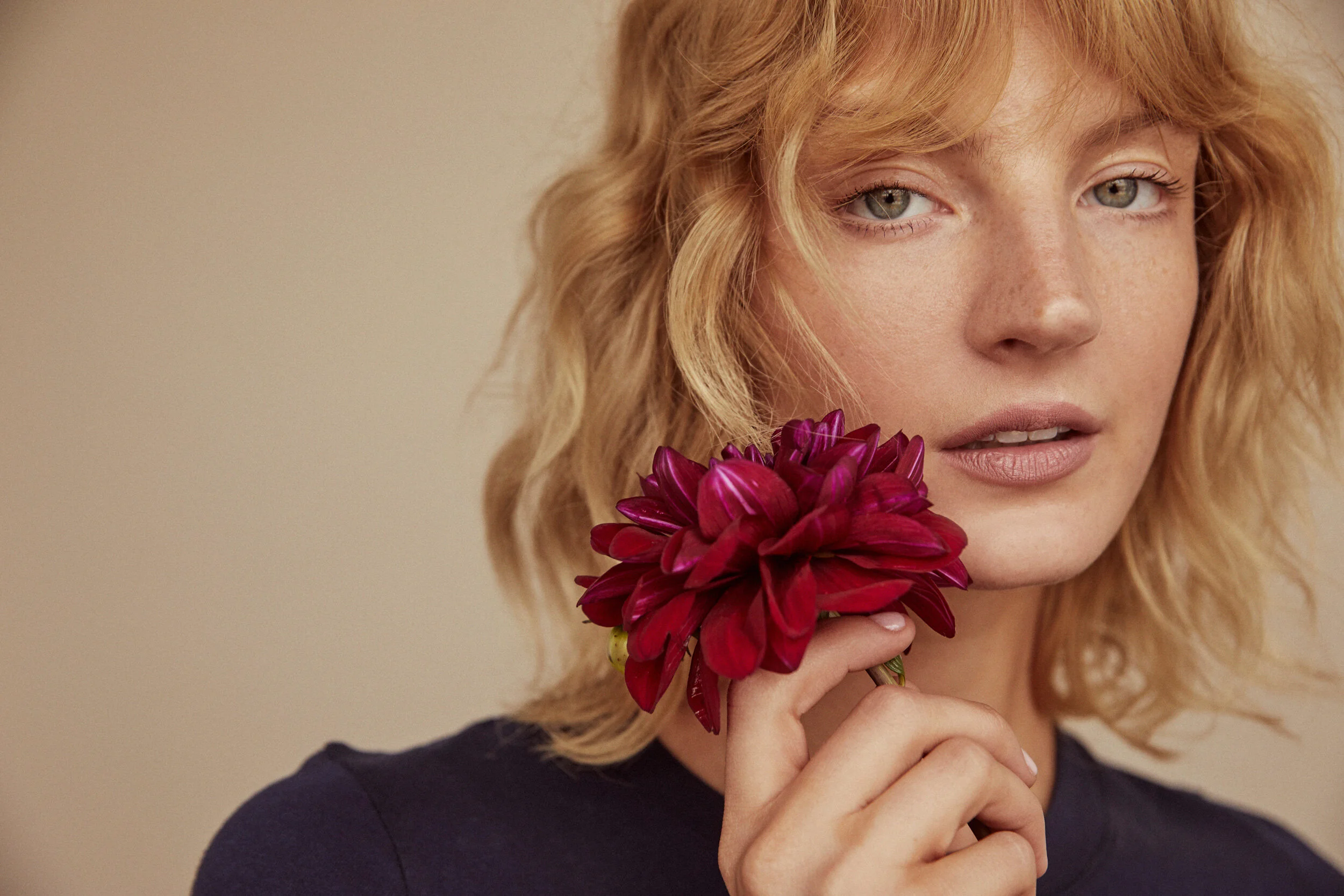
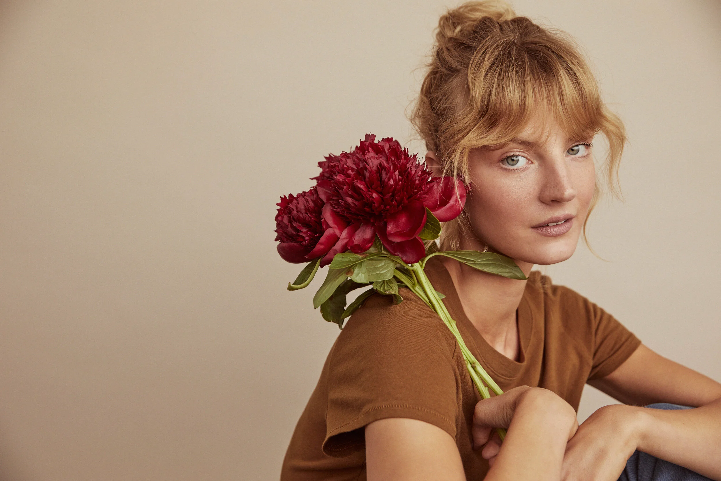
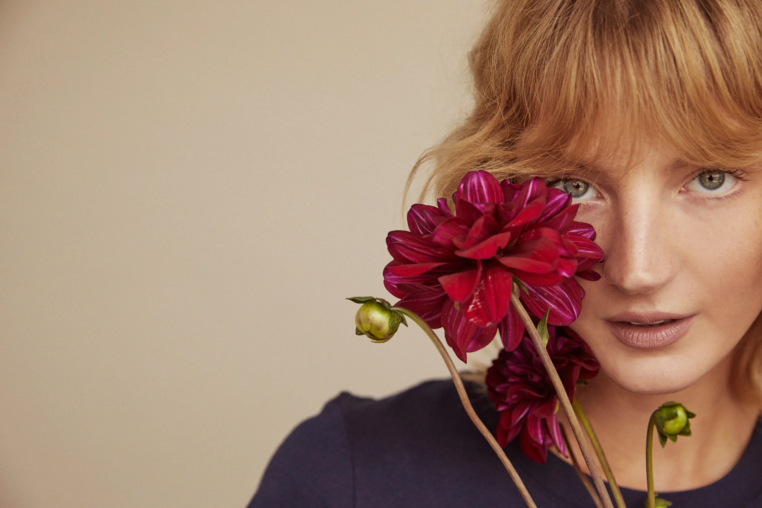
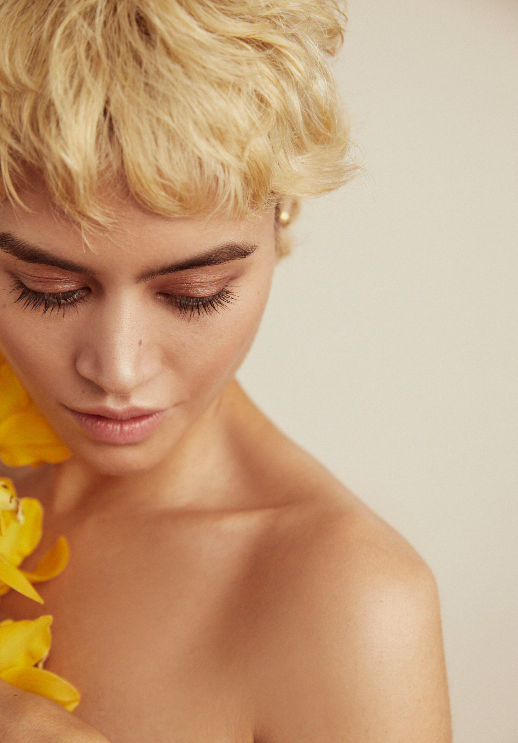
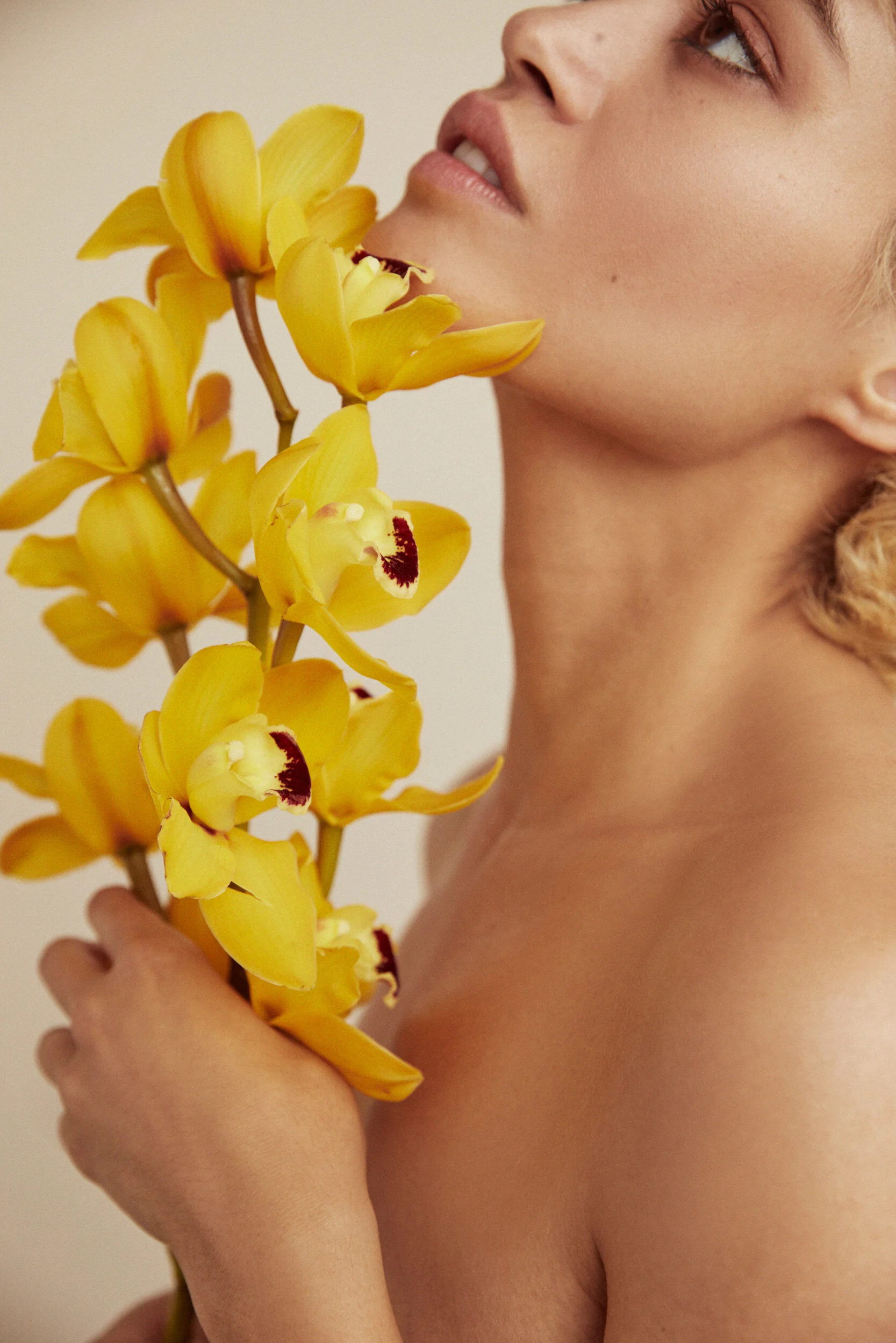
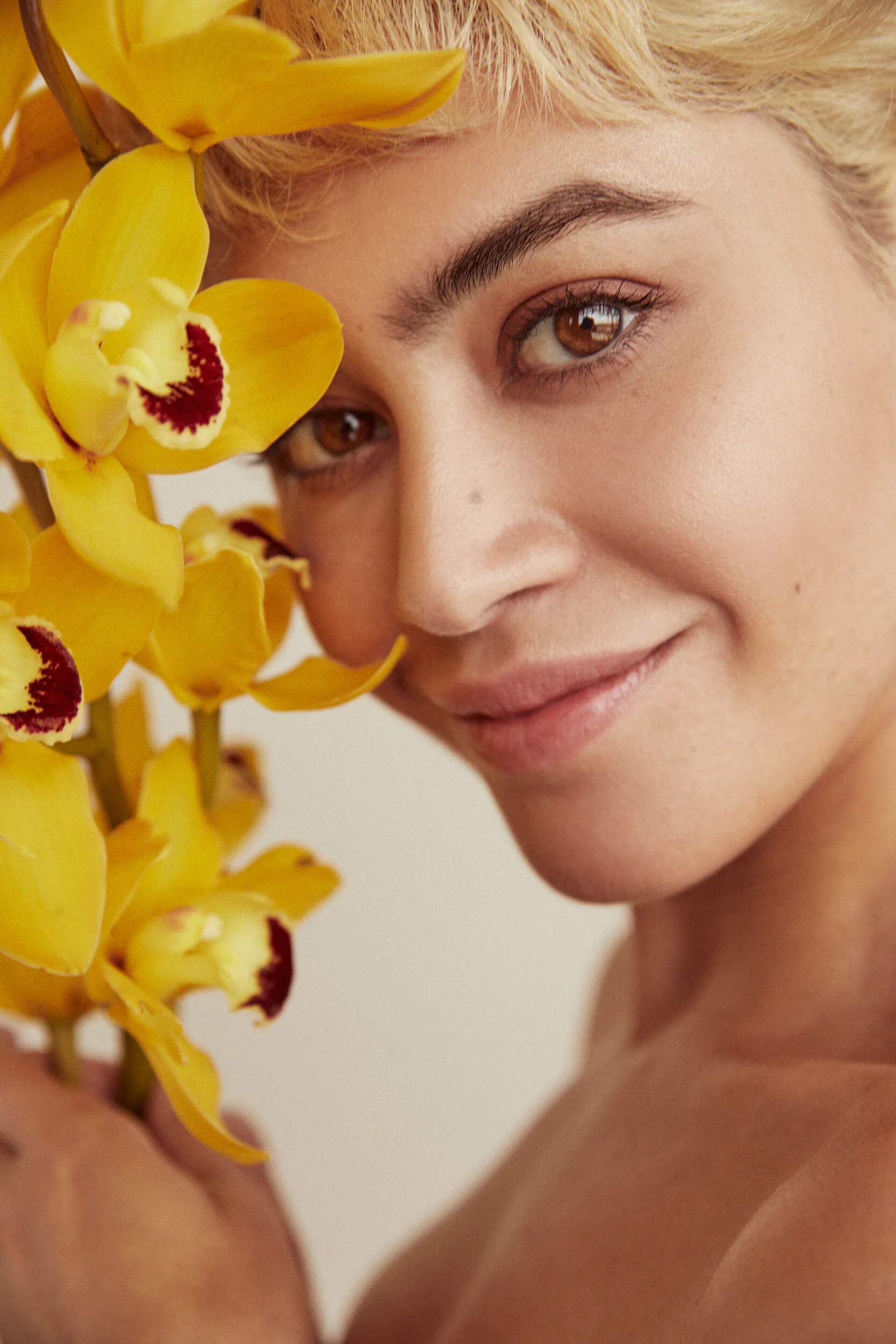
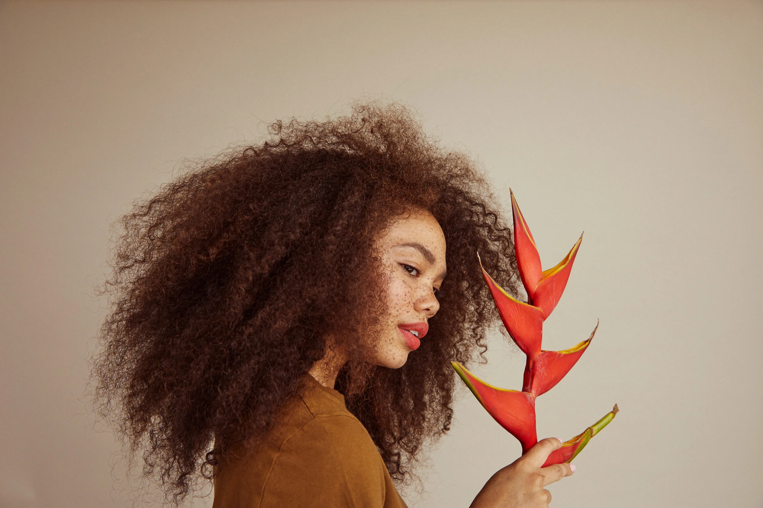
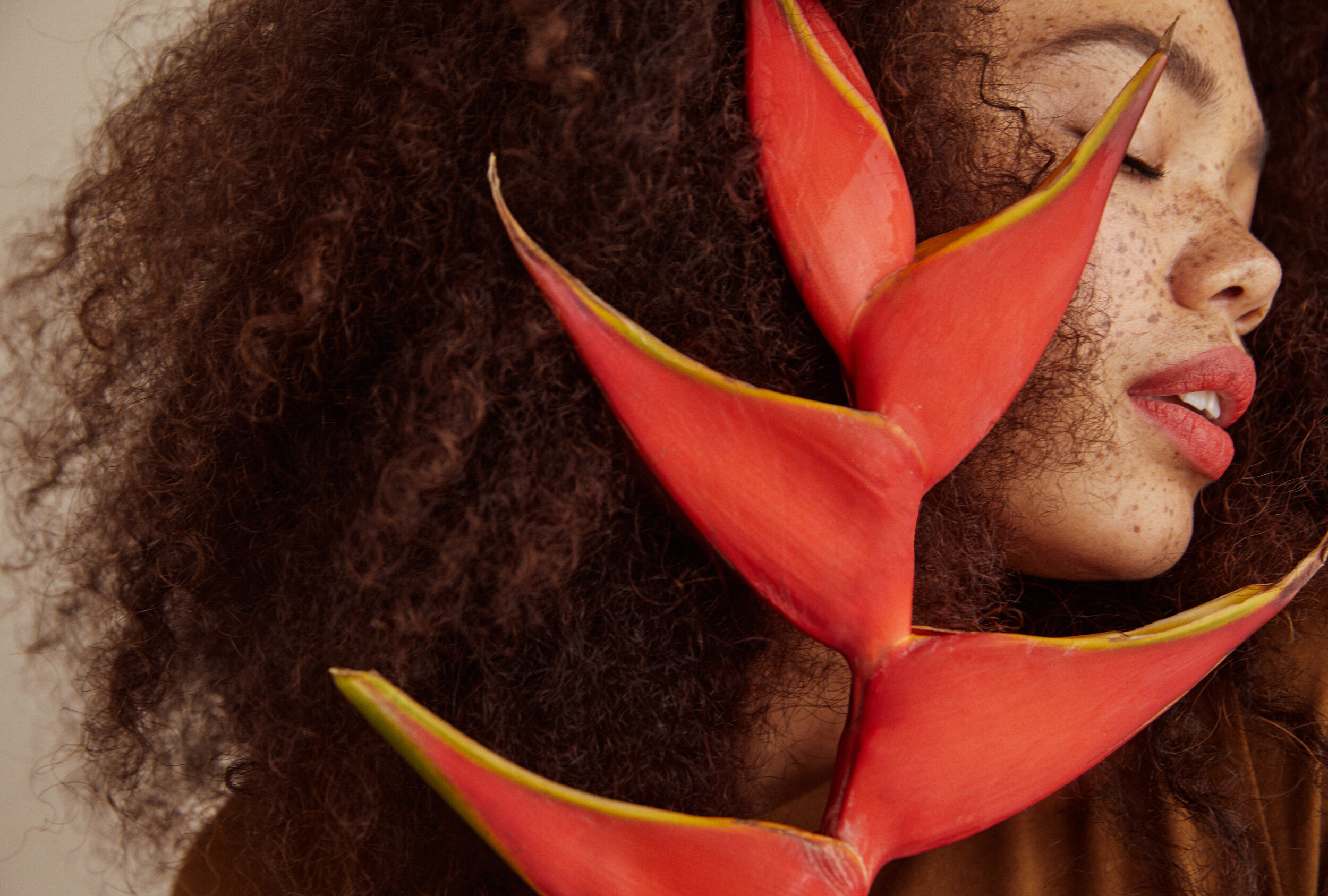
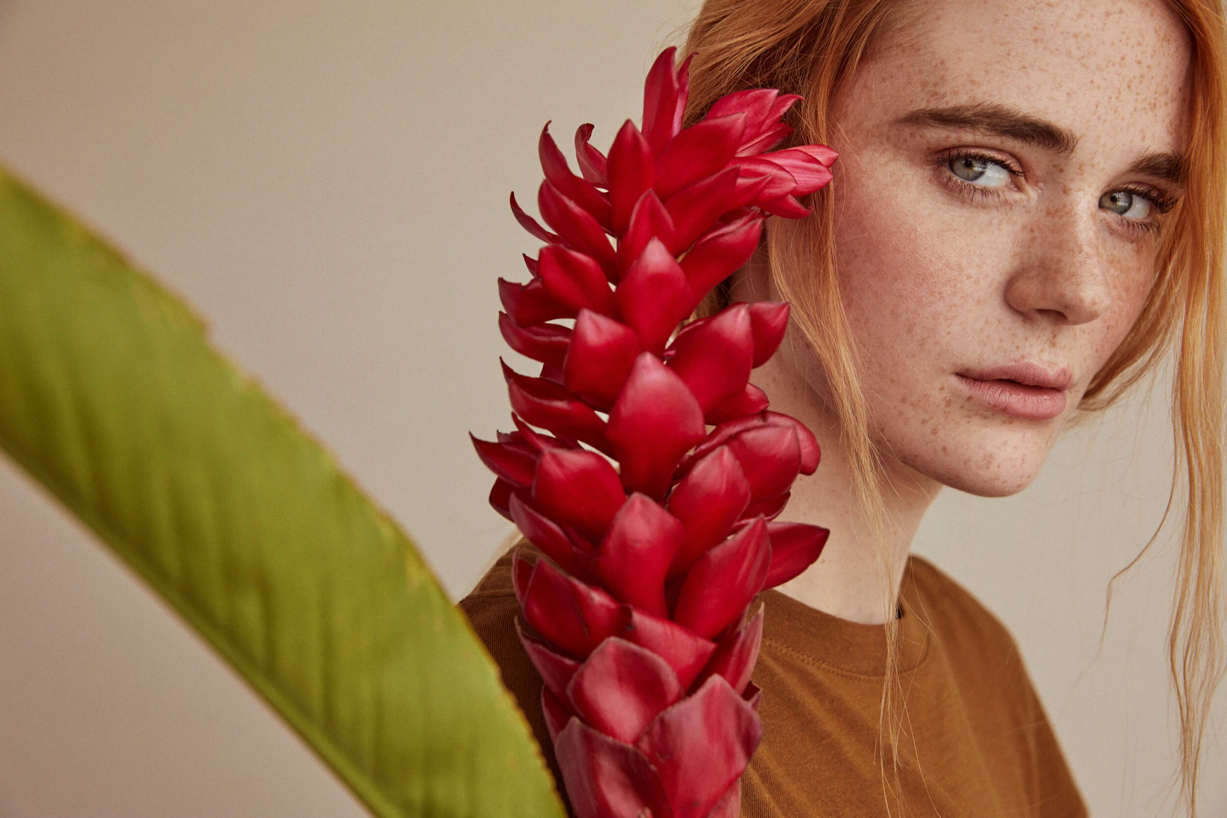
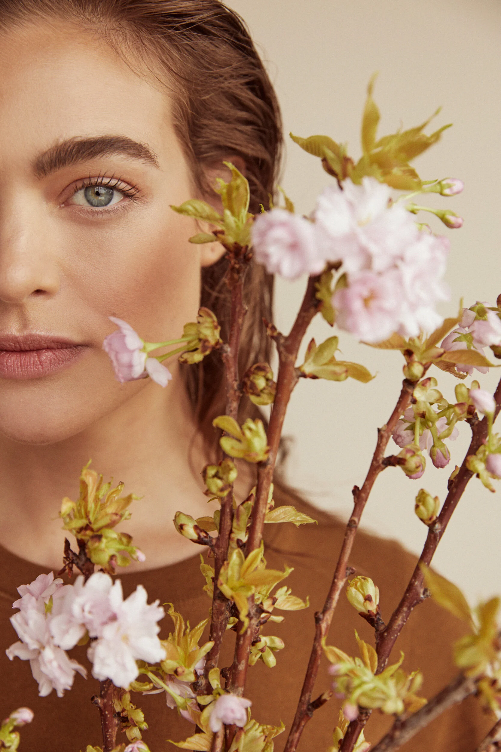
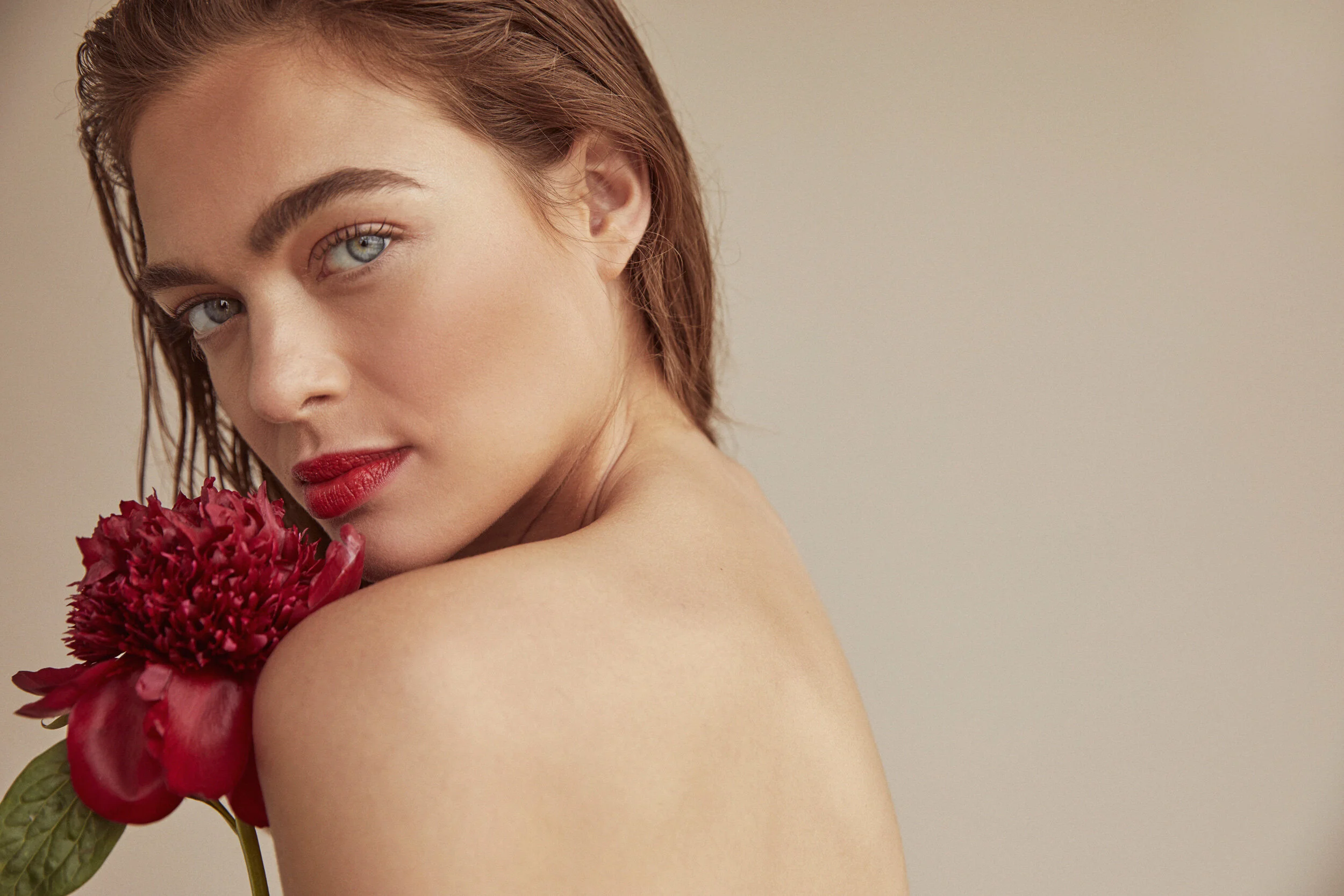
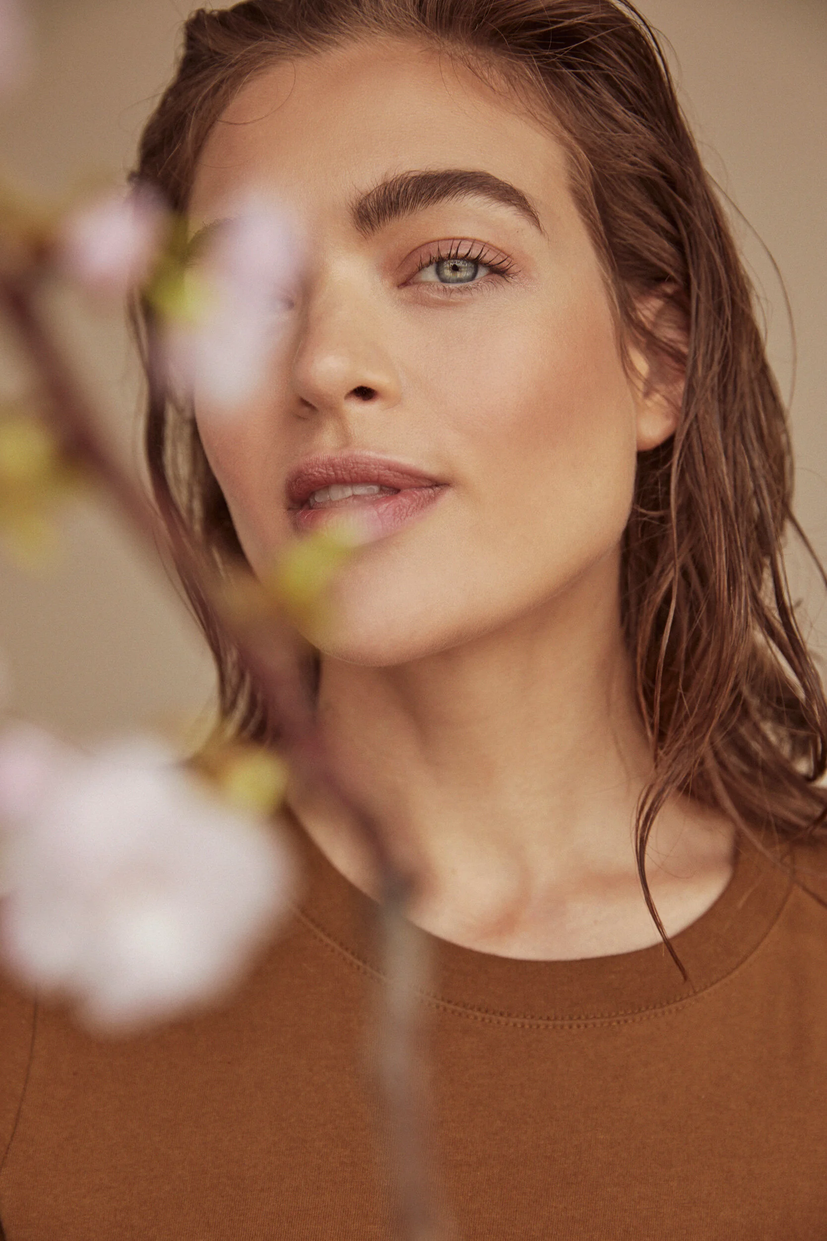
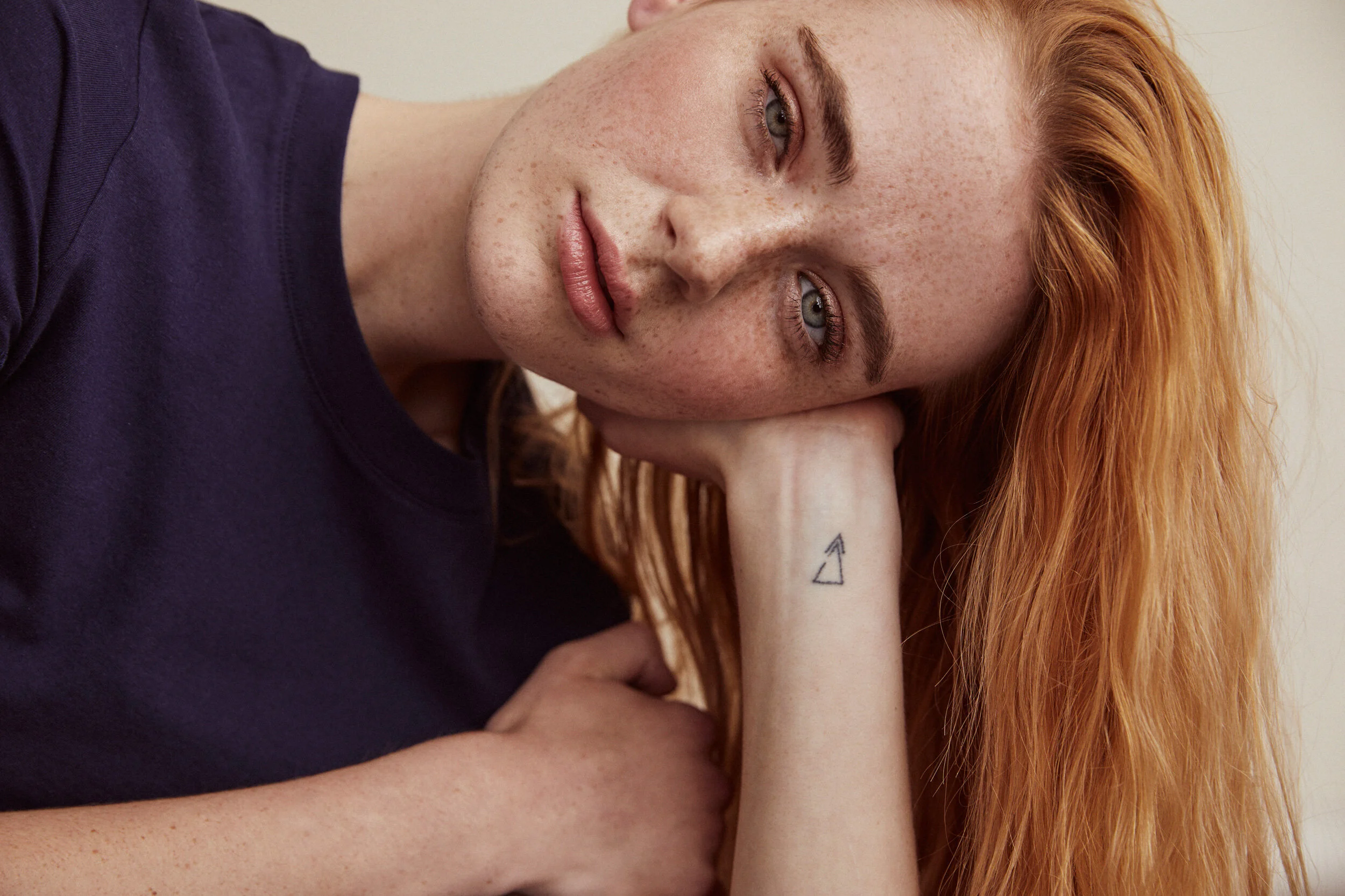
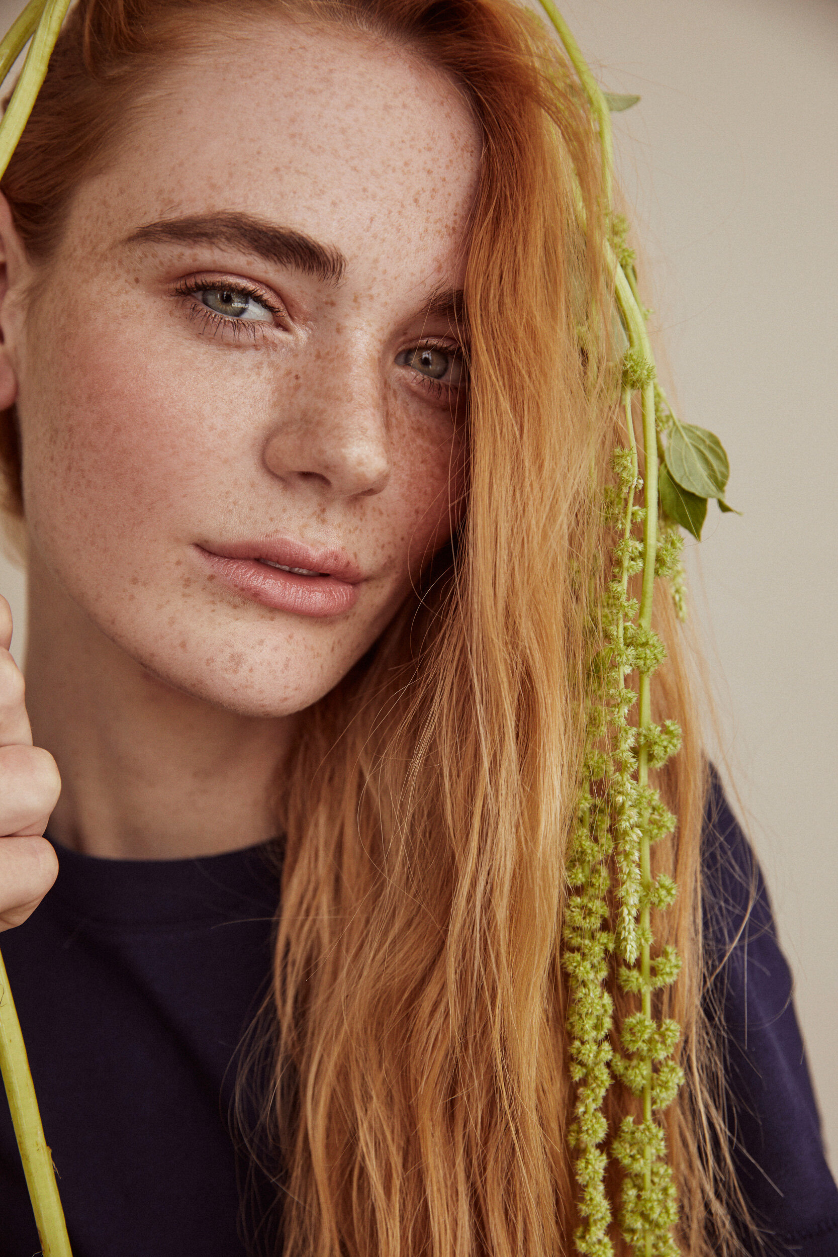
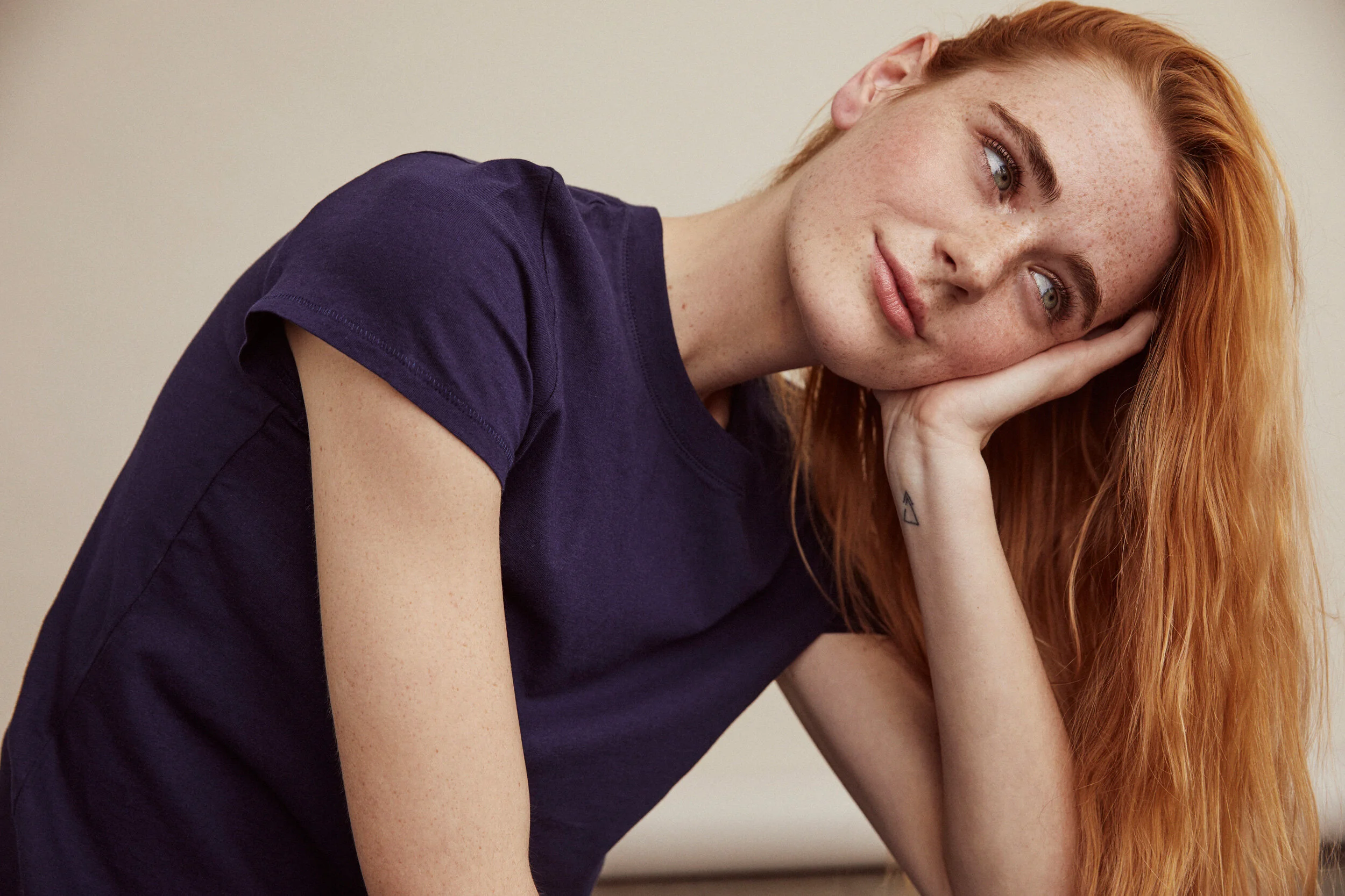
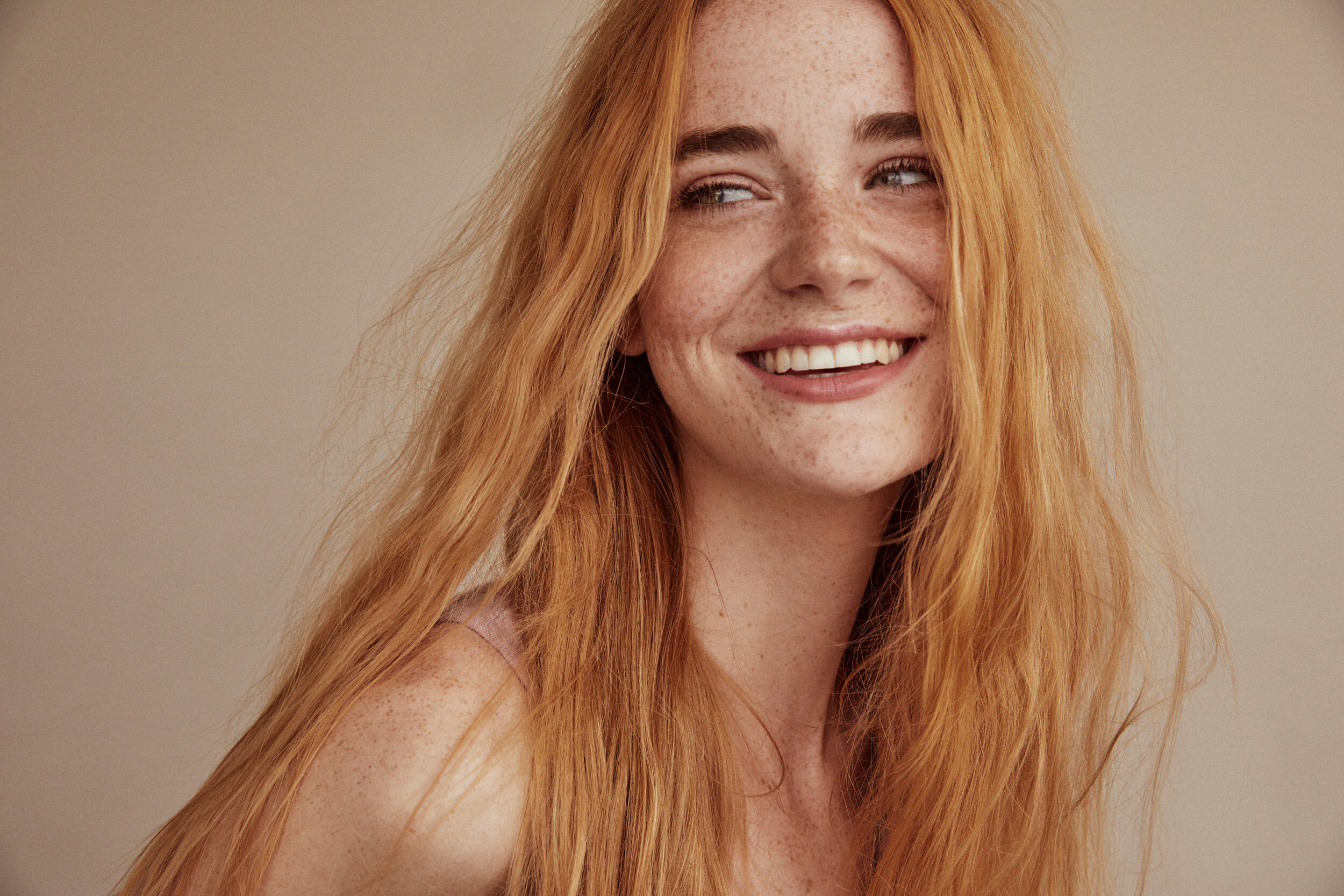
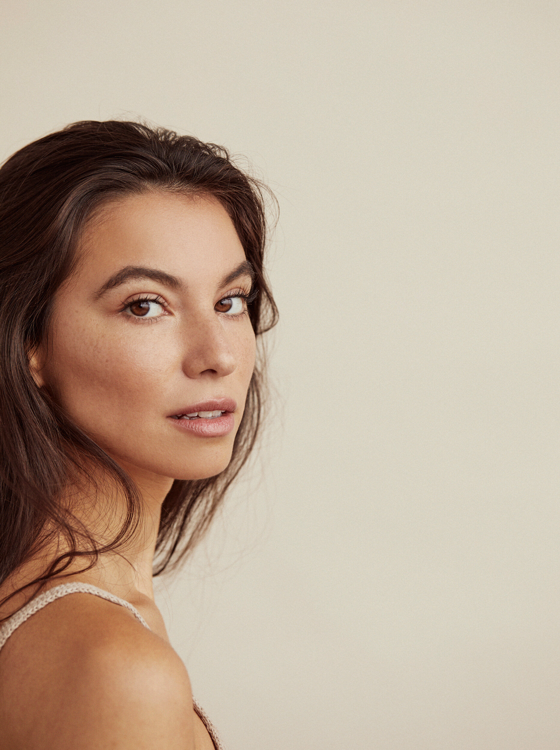
In an effort to showcase Petit Vour’s cruelty-free beauty and lifestyle offerings, we focused on diverse models exuding a “soft strength,” definitive product photography, and copy that is both functional and expressive.
Our mission was to launch a community-building sister campaign called #StoriesOnTheGround, while creating a shopping-first experience. To that end, our hero features a focused collection of products followed by our launch video for #StoriesOnTheGround (see below). Then we featured the Beauty Box (an offering through which most customers discover our brand) with copy that details the company mission and functionally describes what the customer can expect to receive in the box.
More curated shopping collections follow the box and then a promotional banner proclaiming our Free Shipping threshold and Rewards Program. A second video generates more interest through movement, followed by more shopping collections and finally bookended with the company standard. Lastly, we reworked the navigation to allow for mega menus and added a promotional banner at the top of the site that showcased the current GWP (Gift With Purchase) to drive conversion.
Campaign Videos
We created two mood-setting inspirational videos to help launch the new branding campaign inspired by the quote: “If you could be anything in the world, be kind.” I wrote the copy and provided our team with art direction for the videos.
The Branding
I combined the hearty, wholesome Meno Banner typeface in Extra Bold for headers with reader-friendly Roboto. A third font, Karla, served as an accent for the navigation and call-to-actions. We used chocolate-inspired neutrals as our base palette to evoke nature and warmth.
The Product Page
We simplified the shopping experience by separating variants, streamlining font hierarchy, introducing zoom functionality and adding a “More to Shop” product scroll at the bottom of each product page. We also increased conversion by adding an “Earn PV Points” dropdown that detailed how shoppers could earn and use points on items purchased.
I created a brand style guide not just for the typography and colorways of the site, but also for all of our product (off-model) photography. Our photography team uses my guidelines and retouching standard for any in-house imagery we create: both e-commerce shots and creative lay-downs.
Customized Brand Promos
In an effort to boost shopping from leftover Beauty Box products, we created targeted Brand Promotions – for a denoted dollar amount spent on a particular brand, customers would receive a Free Gift from that brand. While Shopify’s built-in platform allows the editing of individual collections and products, the process simply was not efficient to go through each collection and product page of the brand (sometimes 50 at a time!) to add that brand’s promo via the editable text box.
To that end, I created a custom “Click to View” code using Shopify’s liquid language Ruby that would allow us to edit specific collections and all the product pages in those collections at the same time in the same place, effectively streamlining the process for easy future updates.
Click through the slideshow to view the Promo Bar at the top of the collection page, plus the “Click to Reveal” text that appears on every product page in that collection.


E-mail Marketing
At Petit Vour, I oversaw strategy and production of all email marketing and targeted flows through Mailchimp and then Klaviyo. I also helped strategize our editorial calendar alongside partnerships and product launches. Here is a selection of emails created after the rebrand.
Photo Direction
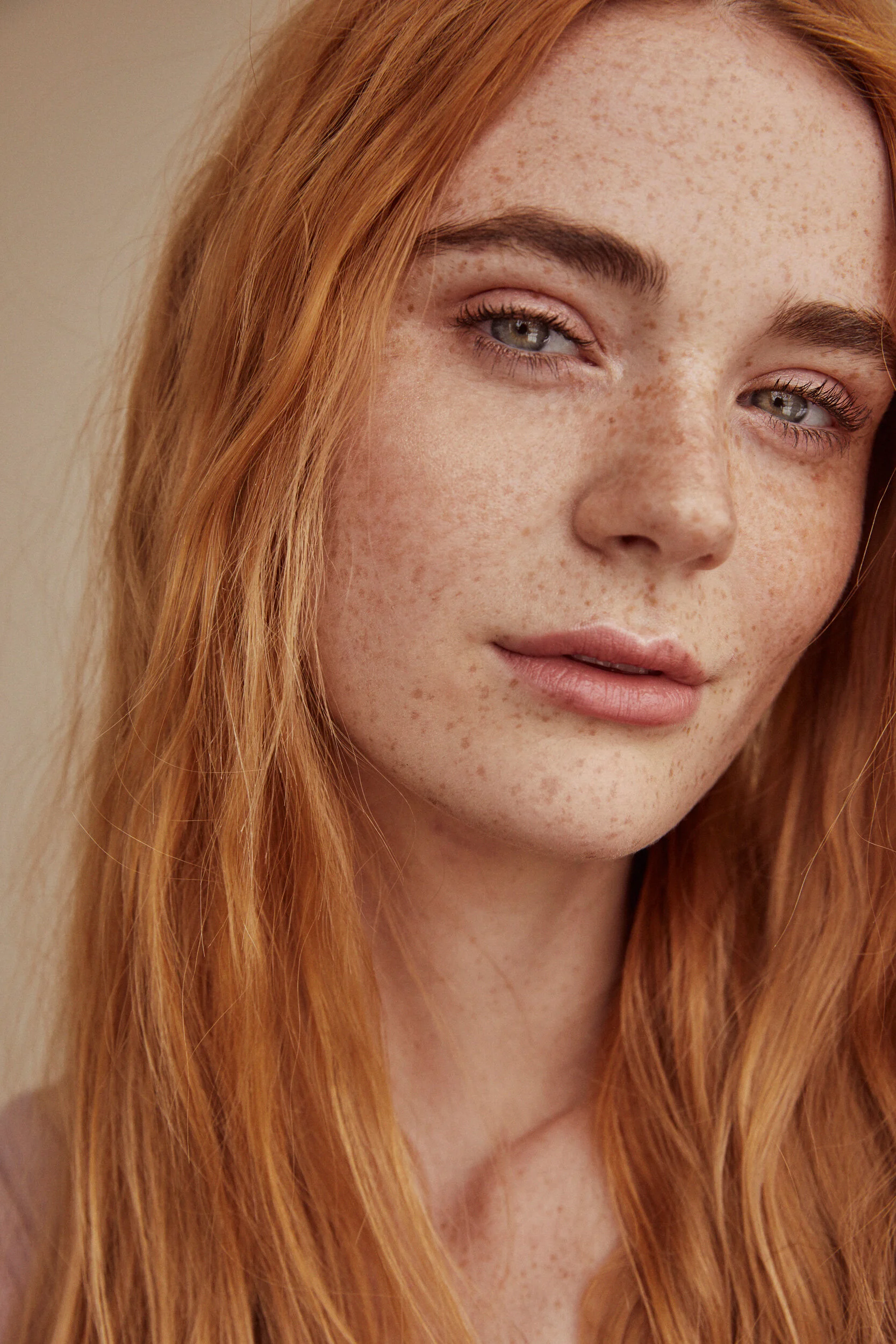
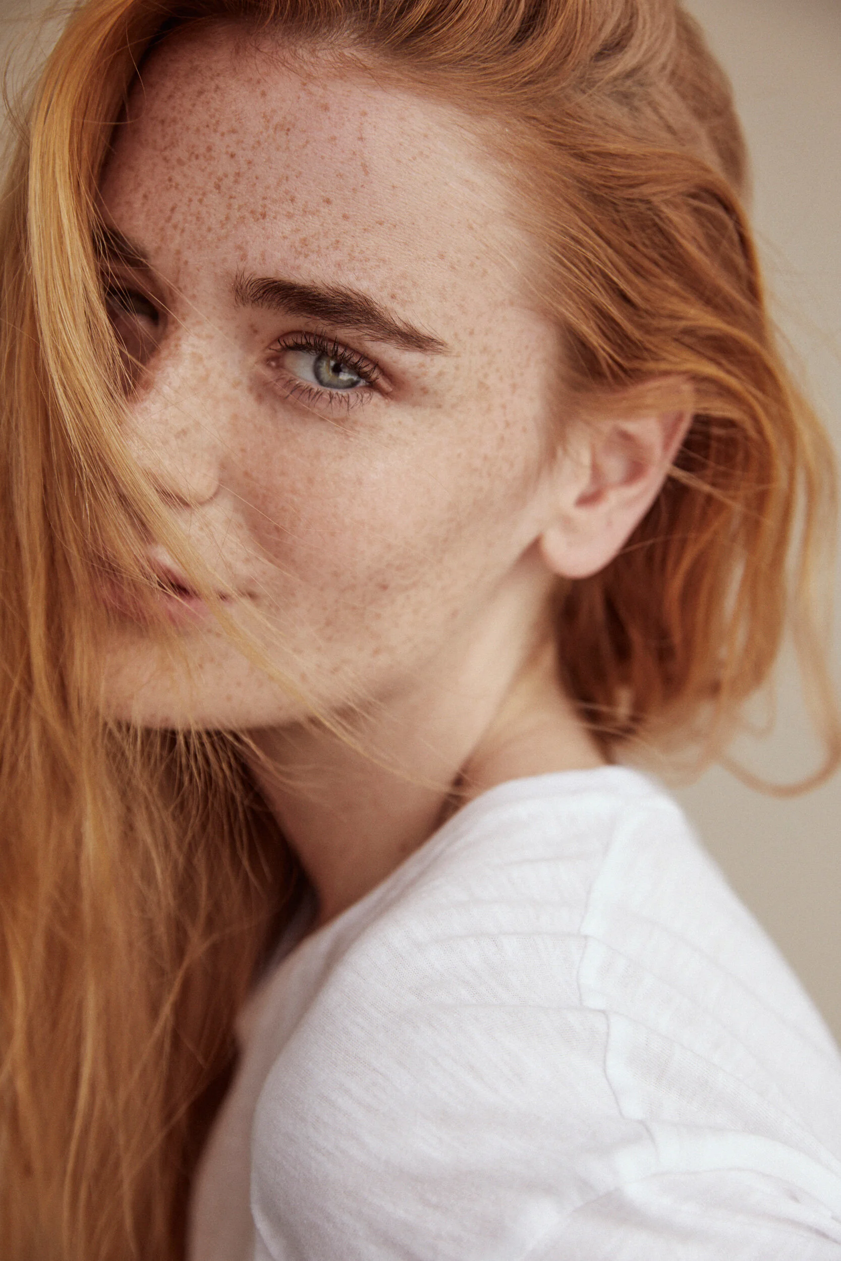
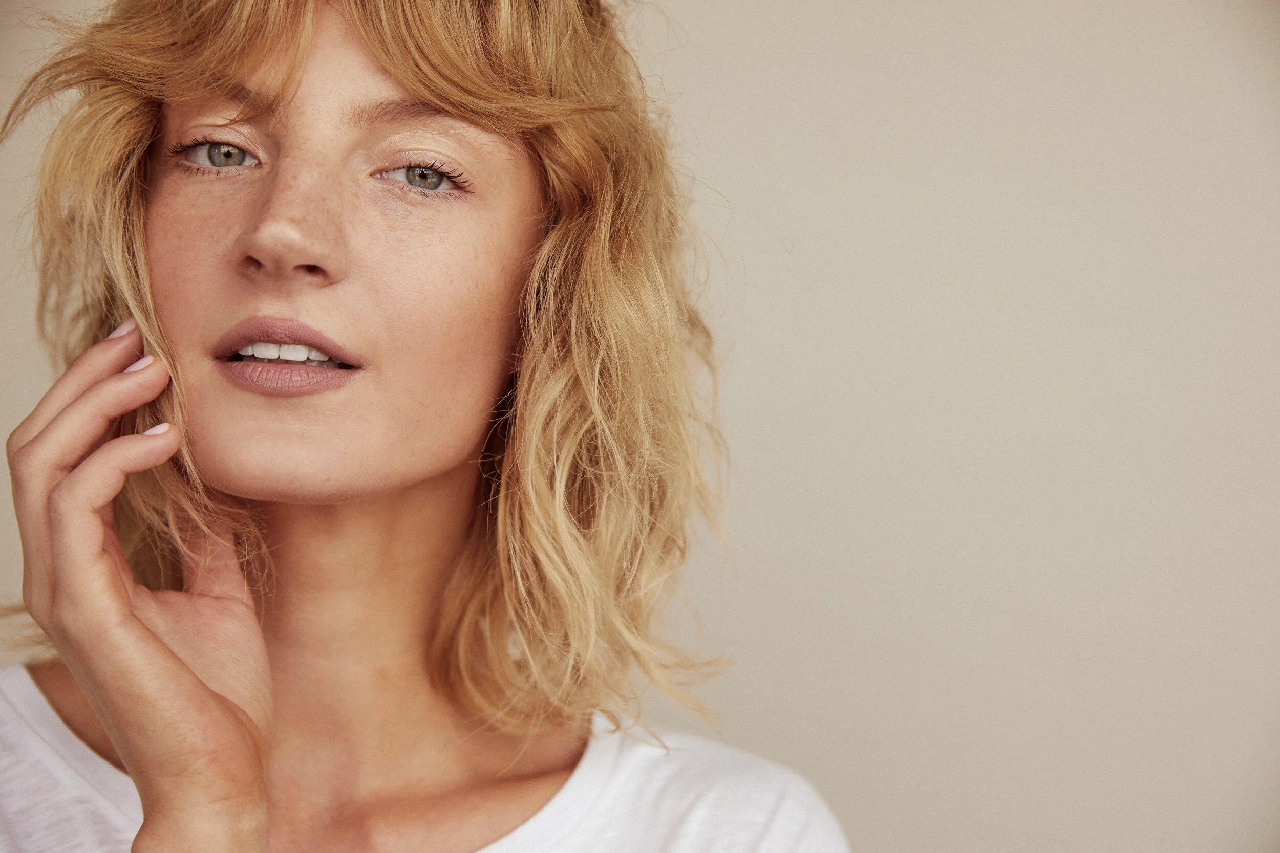
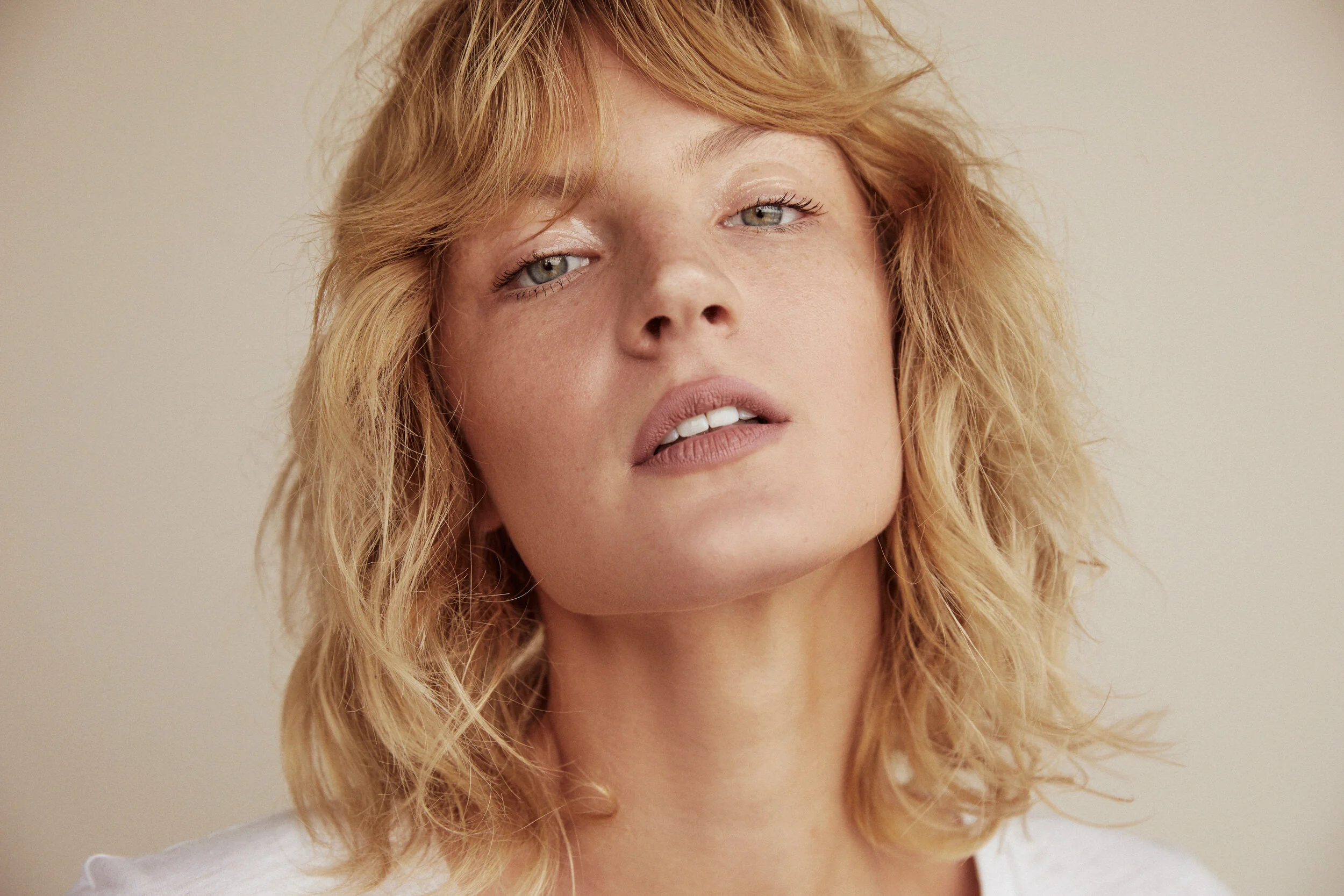
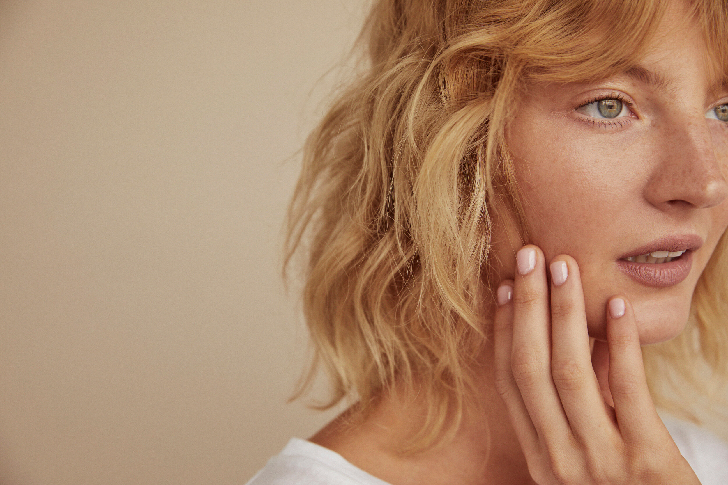
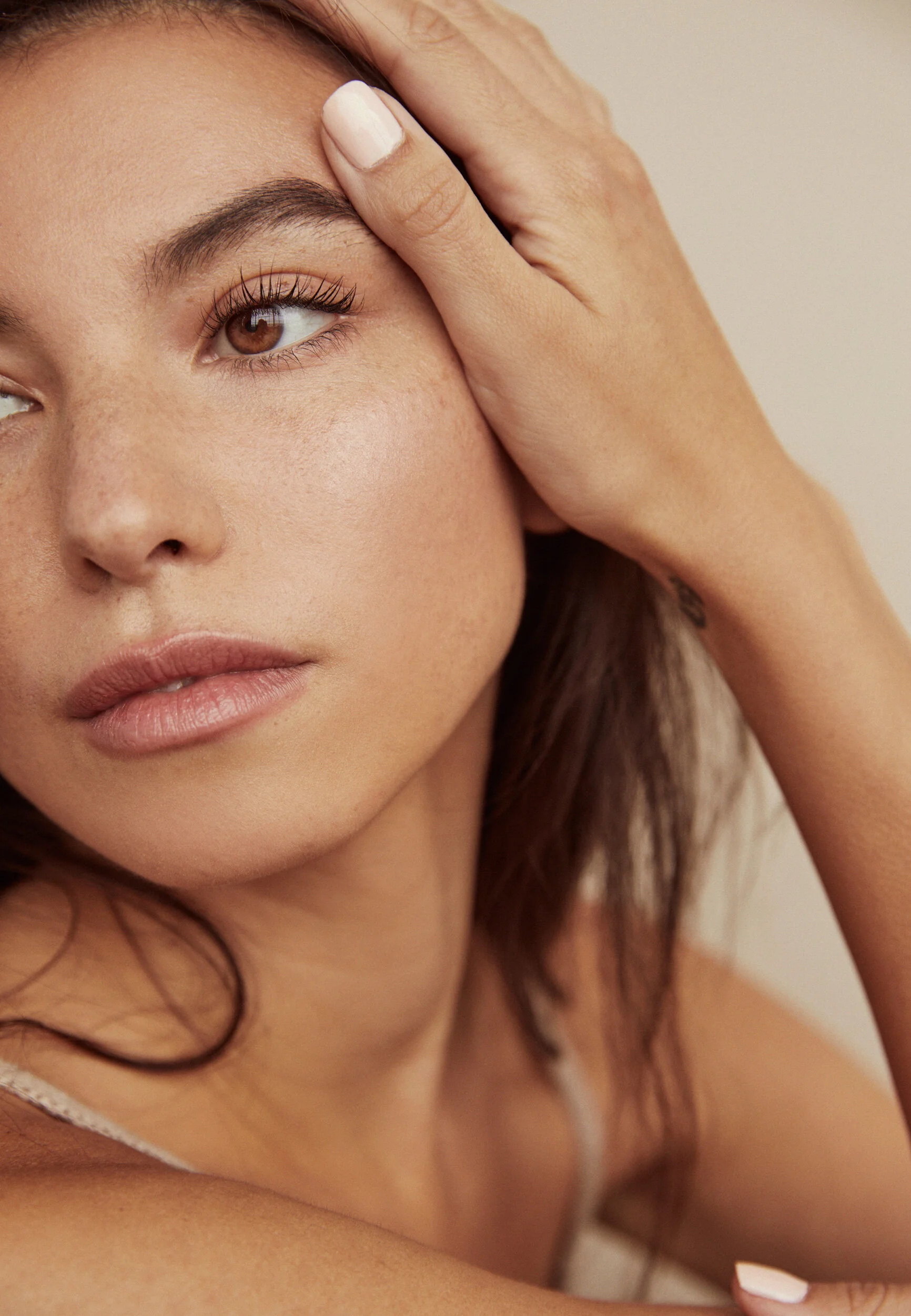
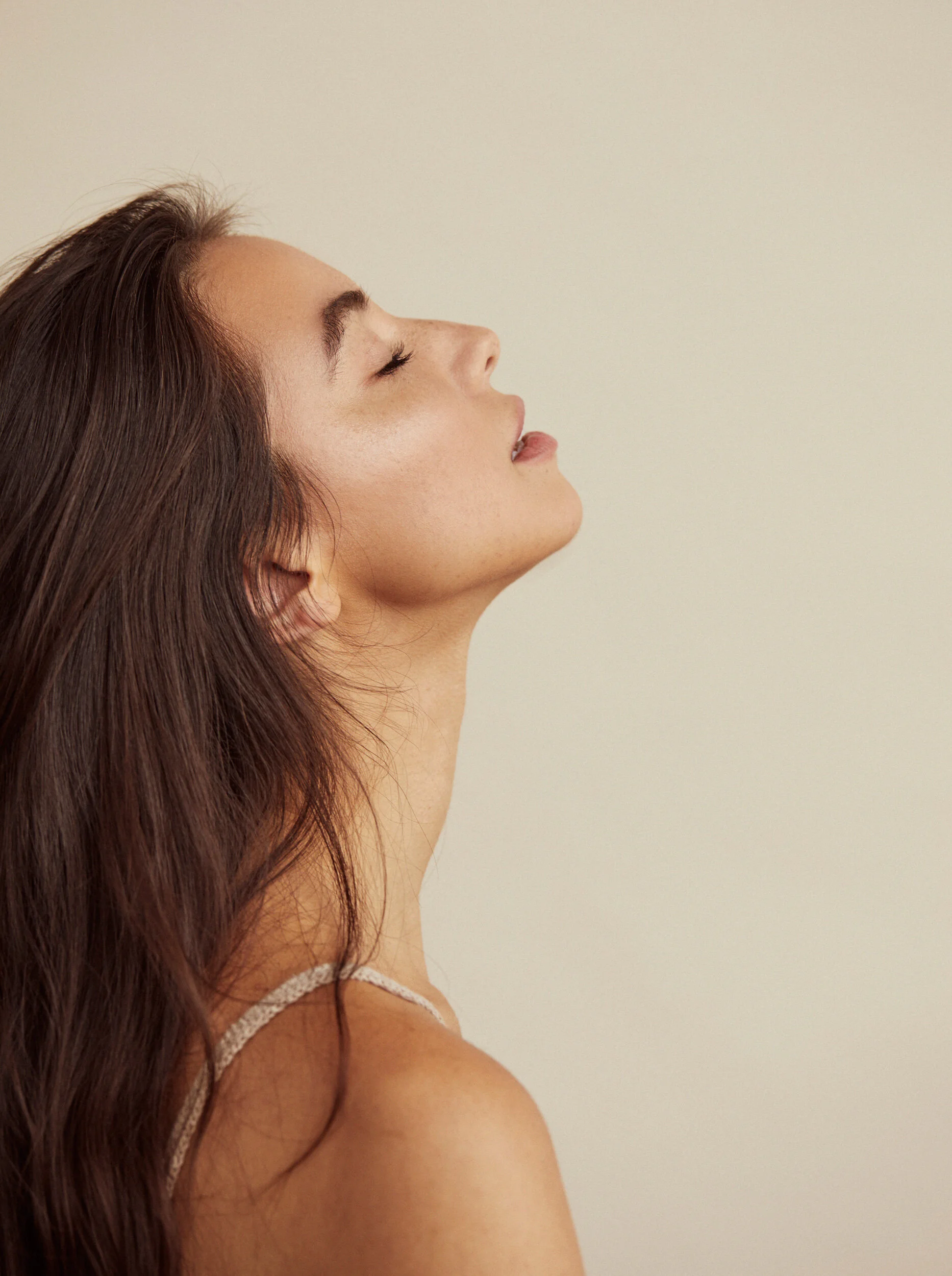
We wanted to supplement our product photography with elevated skin-focused imagery to bring in the human element and to draw a more direct connection between the brand’s beauty offerings and their cruelty-free, plant-based mission.
The tighter shots (3/4 to portraiture) would also allow us to use strategic crops to speak to specific collections in the retail shop (fragrance, hair care, lip makeup, etc) and to use as heroes for future blog posts on related topics.
Visual Assets
Key Learnings
A photoshoot and rebrand is nothing if not marketed through the correct channels, and cannot be relied on solely to increase conversion or drive customer lift.
Great design is often confused with “great looking”. Just because a design is pleasurable to look at does not mean it is well designed. Oftentimes it is the UX and functional design solutions that create the most impact.
During the construction of this campaign, we weren’t able to gather important qualitative customer feedback. This made it difficult to help our team make evidence-based decisions. While not an uncommon issue, this wasn't solved from simply raising these issues in meetings. Approval of A/B testing to ensure desirability of customers could have been an effective way to expose important unknowns and collect directional research.


